Creating Transitions with CSS
In this session, you explore how to use CSS transitions and animations to add movement and action to your websites without relying on video files or external plug-ins. You start by examining how to create a CSS transition.
Introducing Transitions
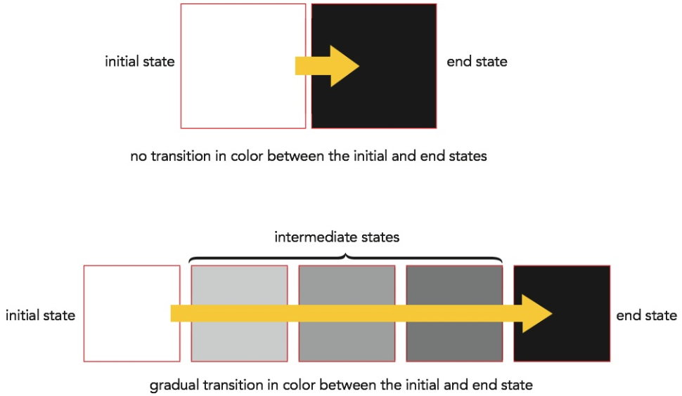
A transition is a change in an object’s style from an initial state to an ending state, usually in response to an event initiated by the user or the browser. You have already worked with this type of effect starting in Tutorial 2 when you employed the hover pseudo-class to change the style of a hypertext link in response to the user moving the mouse pointer over a hypertext link. However, the hover effect is instantaneous with no intermediate steps. If the background color of the link were to change from white to black, there is no instant in which the background is gray. A transition on the other hand, slows down that change and provides intermediate styles so that a white background gradually changes into black, passing through different shades of gray (see Figure 8-31).

To create this type of transition, you employ the following transition style
transition: property duration;
where property is a property of the object that changes between the initial and end states and duration is the transition time in seconds or milliseconds. The following style rules use the transition style to create a transition for the background style as the hypertext link goes from an initial state to an end state (hovered) over a 4-second interval:
    a {
        background: white;
        color: black;
        transition: background 4s;
    }
    a:hover {
        background: green;
        color: white;
    }
In this example, the background color gradually changes from white to light green and then progressively to darker shades of green. This transition happens over the 4-second transition, during which the intermediate states showing the changes in color are displayed (see Figure 8-32).

Note that only the background changes in the intermediate states. The text color stays black until the end state is reached because the color property is not included in the transition. To apply the transition to more than one property, enter the properties and their duration times in the following comma-separated list:
transition: background 4s, color 4s;
In this example, the background color changes gradually from white to dark green at the same time that the font color changes gradually from black to white (see Figure 8-33).

The duration values for multiple properties does not need to be the same: one property could change over a 4-second interval while another property might change over 3 seconds (in which case it would reach its end state a full second before the other property).
Rather than writing each property individually, you can apply the transition to all properties by using the keyword all. Figure 8-34 shows a transition applied to all of the properties that change between the initial and end states, creating an effect in which the object changes background, text color, and rotates 90° over a 4-second interval.
Creating an Asymmetric Transition
By default, a CSS transition is a symmetric transition because the transition going from the initial state to the end state is the reverse of the transition going from the end state back to the initial state. Thus, a text color that goes from red to blue as the mouse moves over an object during the hover event will go from blue back to red as the mouse moves away.
To create an asymmetric transition involving different transitions in the two directions, you must define transitions for both the initial and end states. For example, with the hover event you would create two transition styles:
a {transition: properties}
a:hover {transition: properties}
The style rule for the a selector is applied when the mouse moves away from the page object and the style rule for the a:hover selector is applied when the mouse moves toward and over the page object. Note that the two transitions can involve totally different effects and durations. One transition might involve changes to font size and color while the other transition might only modify the background color. One transition can take place over a span of 2 seconds while the other might take 4 seconds.