Objectives
By the end of this lesson you should be able to:
-
Indentify the three primary components of responsive design
-
Implement the Web browser Viewport meta property and measuring system
-
Implement a flexbox strucutre into an HTML document
-
Create flex items in a flexbox structure
-
Set the flex basis
-
Reorder flex items
-
Implement media queries to accomodate different devices and screen sizes
-
Implement a meta viewport tag into an HTML document head section
Keywords
Introduction to Responsive Design
Web page viewing is no longer limited to just desktop computer screens. These days you can expect your Web pages to be viewed on a multitude of devices, primarily smart phones, tablets, laptops, smart watches, and smart TVs in addition to desktop computer screens. In order to make your Web pages viewable on all of these devices you need to incoporate responsive design techniques into your page compositions.
Typically, smartphone viewers will view your web page in portrait orientation on a wide range of screen sizes. Tablet users will notrmally view your Web pages in a landscape orientation also on a wide range of screen sizes. Laptop, desktop, and smart TV users will generally view your pages in landscape orientation as well and the screen sizes can range from 10 inches to 100 feet or more.
In this tutorial you will be learning various techniques for incorporating resonsive design into your Web pages.
Primary Components of Responsive Design
In 2010, Ethan Marcotte coined the term responsive design in his seminal List Apart article. Since that article, Ethan has written several books about responsive design, including Responsive Web Design in 2011.
- Flexible layout where the page layout automatically adjusts to screens of different widths.
- Responsive images that rescale based on the size of the viewing device.
- Media queries that determine the properties of the device rendering the page so that appropriate designs can be delivered to specific device widths and orientations.
Viewing a Web page on a desktop computer or a smart TV is a very different experience from viewing the page on a mobile device like a smart phone, a tablet or even a laptop computer. Throughout this lesson you will be exploring the various techniques that can be used to make your Web pages responsive to the device they are being view on.
Flexible Layouts
There are many things a Web developer can and needs to do in order to make a Web page flexible to the viewing size of the device. In this section you will find many of those options identified.
List of device features supported by HTML and CSS.
| Feature |
Description |
| aspect-ratio |
The Web Browser Viewport |
| color |
The number of bits per color component of the output device; if the device does not support color, the value is 0
|
| colo-index |
The number of colors supported by the output device
|
| device-aspect-ratio |
The ratio of the device-width value to the device-height value
|
| device-height |
The height of the rendering surface of the output device
|
| device-width |
The width of the rendering surface of the output device
|
| height |
The height of the display area of the output device
|
| monochrome |
The number of bits per pixel in the device’s monochrome frame buffer
|
| orientation |
The general description of the aspect ratio: equal to portrait when the height of the display area is greater than the width; equal to landscape otherwise
|
| resolution |
The resolution of the output device in pixels, expressed in either dpi (dots per inch) or dpcm (dots per centimeter)
|
| width |
The width of the display area of the output device
|
The Web Browser Viewport
The browser's viewport is the area of the window in which web content can be seen. This is often not the same size as the rendered page, in which case the browser provides scrollbars for the user to scroll around and access all the content.
Narrow screen devices (e.g. mobiles) render pages in a virtual window or viewport, which is usually wider than the screen, and then shrink the rendered result down so it can all be seen at once. Users can then pan and zoom to see different areas of the page. For example, if a mobile screen has a width of 640px, pages might be rendered with a virtual viewport of 980px, and then it will be shrunk down to fit into the 640px space.
This is done because many pages are not mobile optimized, and break (or at least look bad) when rendered at a small viewport width. This virtual viewport is a way to make non-mobile-optimized sites in general look better on narrow screen devices.
Enter viewport meta tag
However, this mechanism is not so good for pages that are optimized for narrow screens using media queries — if the virtual viewport is 980px for example, media queries that kick in at 640px or 480px or less will never be used, limiting the effectiveness of such responsive design techniques.
To mitigate this problem of virtual viewport on narrow screen devices, Apple introduced the "viewport meta tag" in Safari iOS to let web developers control the viewport's size and scale. Many other mobile browsers now support this tag, although it is not part of any web standard. Apple's documentation does a good job explaining how web developers can use this tag, but we had to do some detective work to figure out exactly how to implement it in Fennec. For example, Safari's documentation says the content is a "comma-delimited list," but existing browsers and web pages use any mix of commas, semicolons, and spaces as separators.
Viewport basics
A typical mobile-optimized site contains something like the following:
<meta name="viewport" content="width=device-width, initial-scale=1">
The width property controls the size of the viewport. It can be set to a specific number of pixels like width=600 or to the special value device-width, which is the width of the screen in CSS pixels at a scale of 100%. (There are corresponding height and device-height values, which may be useful for pages with elements that change size or position based on the viewport height.)
The initial-scale property controls the zoom level when the page is first loaded. The maximum-scale, minimum-scale, and user-scalable properties control how users are allowed to zoom the page in or out.
Warning: Usage of user-scalable=no can cause accessibility issues to users with visual impairments such as low vision.
A pixel is not a pixel
In recent years, screen resolutions have risen to the size that individual pixels are hard to distinguish with the human eye. For example, recent smartphones generally have a 5-inch screens with resolutions upwards of 1920—1080 pixels (~400 dpi). Because of this, many browsers can display their pages in a smaller physical size by translating multiple hardware pixels for each CSS "pixel". Initially this caused usability and readability problems on many touch-optimized web sites. Peter-Paul Koch wrote about this problem in A pixel is not a pixel.
On high dpi screens, pages with initial-scale=1 will effectively be zoomed by browsers. Their text will be smooth and crisp, but their bitmap images will probably not take advantage of the full screen resolution. To get sharper images on these screens, web developers may want to design images – or whole layouts – at a higher scale than their final size and then scale them down using CSS or viewport properties. This is consistent with the CSS 2.1 specification, which says:
If the pixel density of the output device is very different from that of a typical computer display, the user agent should rescale pixel values. It is recommended that the pixel unit refer to the whole number of device pixels that best approximates the reference pixel. It is recommended that the reference pixel be the visual angle of one pixel on a device with a pixel density of 96dpi and a distance from the reader of an arm's length.
For web developers, this means that the size of a page is much smaller than the actual pixel count and browsers may size their layouts and images accordingly. But remember that not all mobile devices are the same width; you should make sure that your pages work well in a large variation of screen sizes and orientations.
The default pixel ratio depends on the display density. On a display with density less than 200dpi, the ratio is 1.0. On displays with density between 200 and 300dpi, the ratio is 1.5. For displays with density over 300dpi, the ratio is the integer floor(density/150dpi). Note that the default ratio is true only when the viewport scale equals 1. Otherwise, the relationship between CSS pixels and device pixels depends on the current zoom level.
Viewport width and screen width
Sites can set their viewport to a specific size. For example, the definition "width=320, initial-scale=1" can be used to fit precisely onto a small phone display in portrait mode. This can cause problems when the browser doesn't render a page at a larger size. To fix this, browsers will expand the viewport width if necessary to fill the screen at the requested scale. This is especially useful on large-screen devices like the iPad. (Allen Pike's Choosing a viewport for iPad sites has a good explanation for web developers.)
For pages that set an initial or maximum scale, this means the width property actually translates into a minimum viewport width. For example, if your layout needs at least 500 pixels of width then you can use the following markup. When the screen is more than 500 pixels wide, the browser will expand the viewport (rather than zoom in) to fit the screen:
<meta name="viewport" content="width=500, initial-scale=1">
Other attributes that are available are minimum-scale, maximum-scale, and user-scalable. These properties affect the initial scale and width, as well as limiting changes in zoom level.
Not all mobile browsers handle orientation changes in the same way. For example, Mobile Safari often just zooms the page when changing from portrait to landscape, instead of laying out the page as it would if originally loaded in landscape. If web developers want their scale settings to remain consistent when switching orientations on the iPhone, they must add a maximum-scale value to prevent this zooming, which has the sometimes-unwanted side effect of preventing users from zooming in:
<meta name="viewport" content="initial-scale=1, maximum-scale=1">
Suppress the small zoom applied by many smartphones by setting the initial scale and minimum-scale values to 0.86. The result is horizontal scroll is suppressed in any orientation and the user can zoom in if they want to.
<meta name="viewport" content="width=device-width, initial-scale=0.86, maximum-scale=5.0, minimum-scale=0.86">
Viewport Sizes for Mobile and Tablet Devices
If you want to know what mobile and tablet devices have which viewport widths, there is a comprehensive list of mobile and tablet viewport sizes here. This gives information such as viewport width on portrait and landscape orientation as well as physical screen size, operating system and the pixel density of the device.
Using the Viewport Units
Viewport units can be helpful in sizing HTML elements for diferrent size screens and orientations.
- vw - viewport width
- vh - viewport height
Like em, rem, %, ex, ch, viewport units are a relative unit of measurment. Whereas using % for units of measure will adjust an HTML element's size based on the sixe of its containing element. Viewport units will adjust an HTML elements size as a percentage of the viewport, with the value of 100 representing a scale of 100% of either the width (100vw) or height (100vh) of the viewport it is being displayed in.
Responsive Images
Media Queries
Media queries inform the Web browser which CSS style rules apply in different device screen sizes (a.k.a. breakpoints) and orientations. To begin a media query you must use the @media identifier and encapsulate all the css rules that apply within a set of curly braces.
@media screen and (max-width: 760px) {
style rules
}
@media screen and (min-width: 480px) {
style rules
}
@media all and (min-width: 320px and max-width: 480px) {
style rules
}
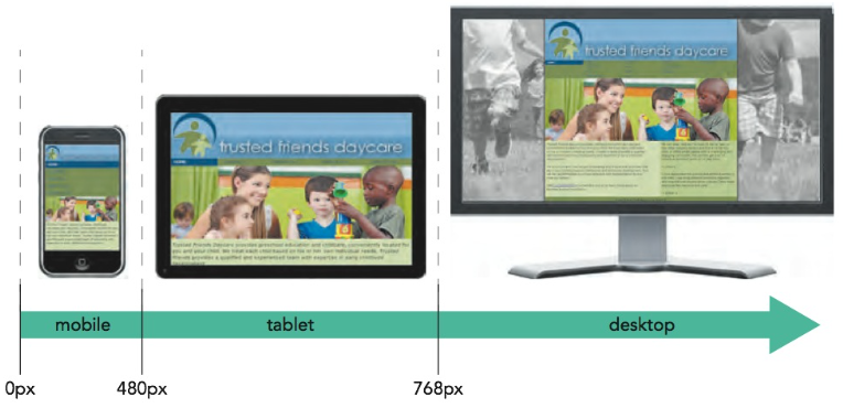 Common screen size breakpoints used in media queries.
Bootstrap Breakpoints Core Concepts
- Breakpoints are the building blocks of responsive design. Use them to control when your layout can be adapted at a particular viewport or device size.
- Use media queries to architect your CSS by breakpoint. Media queries are a feature of CSS that allow you to conditionally apply styles based on a set of browser and operating system parameters. We most commonly use min-width in our media queries.
- Mobile first, responsive design is the goal. Bootstrap’s CSS aims to apply the bare minimum of styles to make a layout work at the smallest breakpoint, and then layers on styles to adjust that design for larger devices. This optimizes your CSS, improves rendering time, and provides a great experience for your visitors.
| Breakpoint |
Class infix |
Dimensions |
| X-Small |
None |
<576px |
| Small |
sm |
≥576px |
| Medium |
md |
≥768px |
| Large |
lg |
≥992px |
| Extra large |
xl |
≥1200px |
| Extra extra large |
xxl |
≥1400px |
Formatting the <html> and <body> Tags
In order to avoid horizontal scrolling on a portrait oriented smart phone it is important to assign both the <htm> and the <body> elements an overflow-x property the value of hidden.
            html, body {
                overflow-x: hidden;
Flexbox (container)
To define an element as a flexbox, apply either of the following display styles
            display: flex;
        or
            display: inline-flex;
where a value of flex starts the flexbox on a new line (much as a block element starts on a new line) and a value of inline-flex keeps the flexbox in-line with its surrounding content.
Any area of an HTML document which is defined using the CSS flex property is referred to as a flex container.
property: flex-direction
The flex-direction property defines the main axis of the flexbox.
values(s): row, row-reverse, column, column-reverse
row (default) = lays out rows left to right and defines the main axis as the horizontal axis and the cross axis as the vertical axis.
column = creates a vertical layout starting from the top and moving downward
and defines the main axis as vertical and defines the cross axis as the horizontal axis.
row-reverse, column-reverse = lay out the items bottom-to-top and right-to-left respectively
property: flex-wrap
values(s): nowrap (default), wrap, wrap-reverse
property: flex-flow
Both the flex-direction and flex-wrap properties can be combined into the following flex-flow style
flex-flow: direction wrap
Flex Items
Flex items behave a lot like floated objects though with several advantages, including that you can float them in either the horizontal or vertical direction and that you can change the order in which they are displayed. While the size of a flex item can be fixed using the CSS width and height properties, they don’t have to be. They can also be “flexed” — automatically adapting their size to fill the flexbox. A flex layout is fundamentally different from a grid layout and requires you to think about sizes and layout in a new way.
Setting the Flex Basis
When items are allowed to “flex” their rendered size is determined by three properties:
-
the basis size
-
the growth value
-
the shrink value
The basis size defines the initial size of the item before the browser attempts to fit it to the flexbox and is set using the following
property: flex-basis
flex-basis: size;
property: flex-grow
flex-grow: value;
property: flex-shrink
flex-shrink: value;
property: flex
flex: grow shrink basis;
flex: 0 1 auto;
flex property keywords
| auto |
Use to automatically resize the item from its default size (equivalent to flex: 1 1 auto;) |
| initial |
The default value (equivalent to flex: 0 1 auto;) |
| none |
Use to create an inflexible item that will not grow or shrink (equivalent to flex: 0 0 auto;)
|
| inherit |
Use to inherit the flex values of its parent element
|
Reordering Flex Items
The default ordering value for a flex item is 0. The lower the value the higher the priority.
property: order
order: value;
Logical Properties
The English language is written from left to right and from top to bottom, but not all languages are written this way. Some languages like Arabic and Hebrew read from right to left, and some Japanese typefaces read vertically instead of horizontally. To accommodate these writing modes, logical properties were introduced in CSS.
Logical properties refer to the edges of a box as they relate to the content flow. Logical properties include inline-start, and inline-end, also block-start and block end. Using the English language as an example, inline-start refers to the left, inline-end corresponds to the right, block-start is the same as top, and block-end the same as bottom. If the language changes for the content being displayed, CSS logical properties will update accordingly. That's not the case with directional propeties like left, right, top, and bottom.
Responsive Design Resources
Responsive Web Design -
This
is the article that started the Web development community
literally thinking outside the box - meaning ditching the page paradigm
handed-down from print media and embracing the fact that Web doesn't
have the same constraints and that its content can be viewed by devices
which could be shaped into of a variety of form
factors.
⇑ Table of Contents